New Navigation
2021 Dec 24 - by Robert Giordano | Blog Index
It's Christmas Eve and I just finished a new navigation system for user pages. I've been trying to come up with the best way to navigate between your links, tags, and friends. I've looked at all of the major social media platforms and I use several of them constantly. The interface on each site varies, but most of the time, it just isn't the best. Nothing is consistent and sometimes getting back to a certain screen is confusing. I don't want that for Linkatopia.

Old Navigation
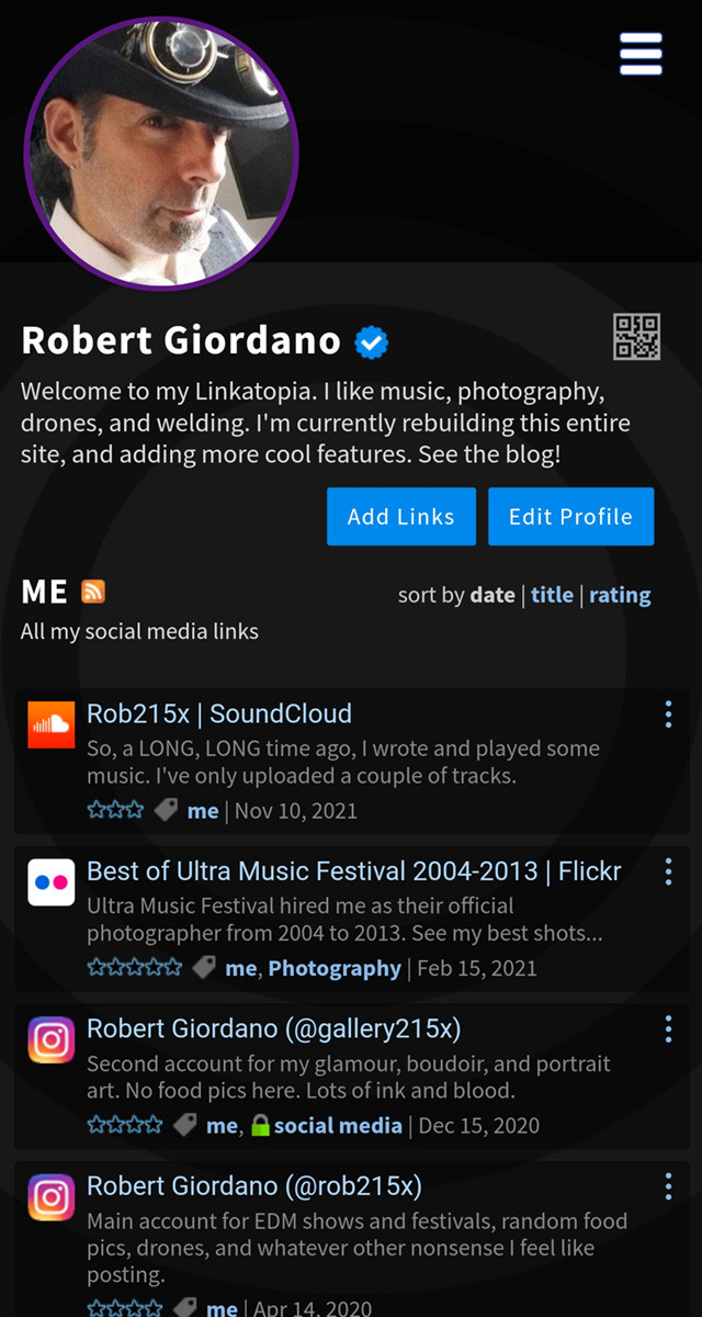
Here's my page on mobile showing the old navigation. I'm getting rid of those big blue buttons. They disappear when you scroll the page and if you're scrolled way down on a long page, you have to scroll all the way back to the top to use them. Also, there's no easy way to get to your tags or friends. You have to use the main drop-down menu in the top right corner, or you have to scroll all the way to the bottom of the page. While those methods aren't terrible, I wanted a better way...

New Navigation
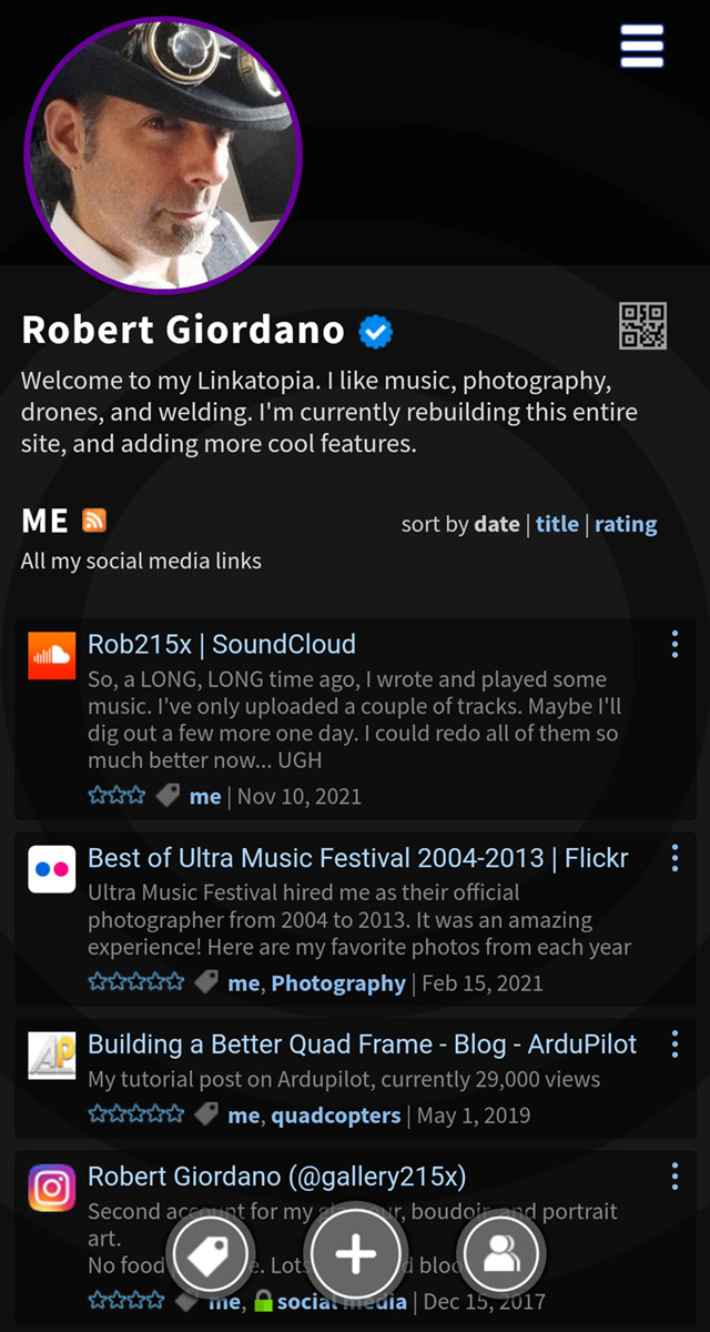
I've removed the big blue buttons at the top, which frees up more space for your links on mobile devices. I've added new navigation buttons at the bottom. These round buttons "float" in place while you scroll the page, so they're always accessible, no matter where you are. From left to right, the buttons are "Tags", "Add Links", and "Friends". Now you can effortlessly switch back and forth between your links, tags, and friends.
When you're on another member's page, the middle button will disappear and you'll only see the tags and friends buttons so you can navigate through their tags and friends.
Inspired by Pokemon Go
While many mobile apps have a row of navigation buttons along the bottom of the screen, I didn't want to give up a chunk of the screen to a big white bar. I looked at many, many apps and sites but the one that inspired this navigation was an app I still play almost every day- Pokemon Go. The game has a number of different screens and some very complex features, but the navigation elements are always simple and easy to use. I felt like this was the way to go.
I hope you like the new navigation buttons as much as I do.
Merry Christmas,
Robert
